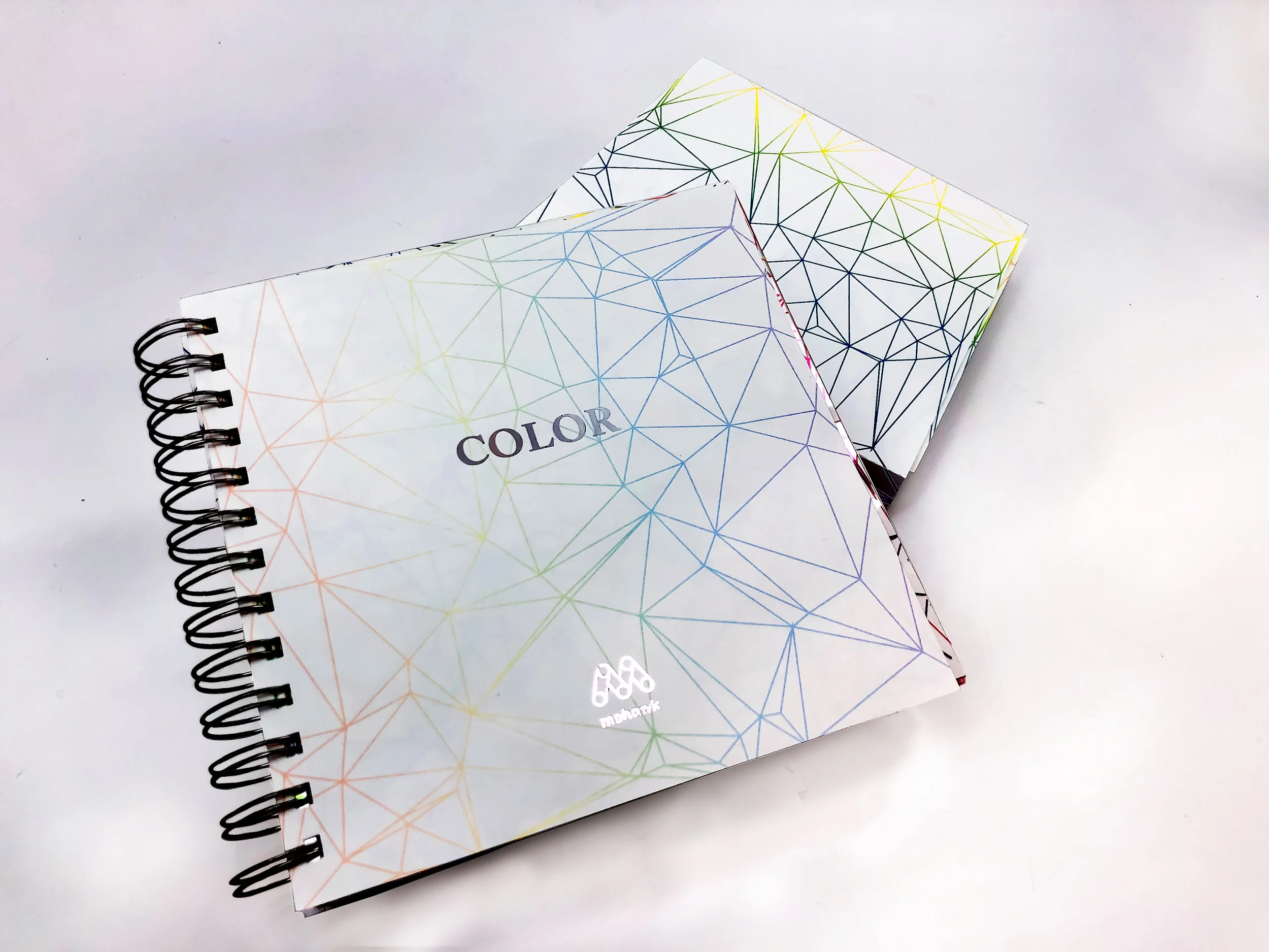
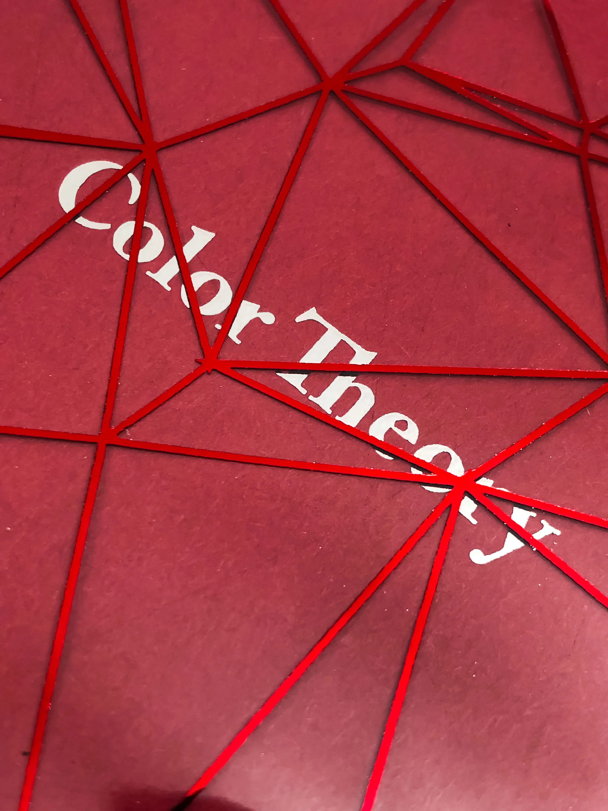
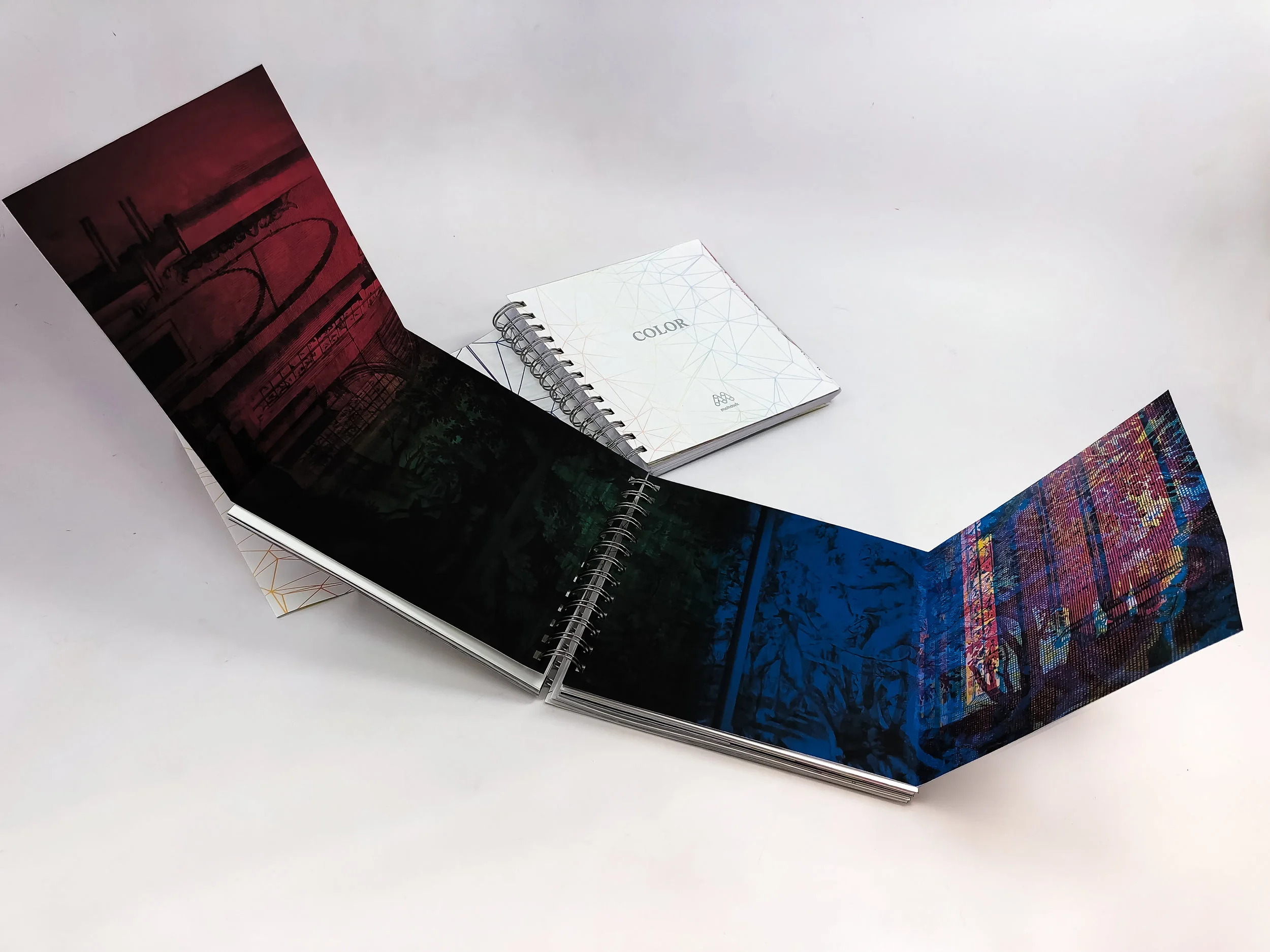
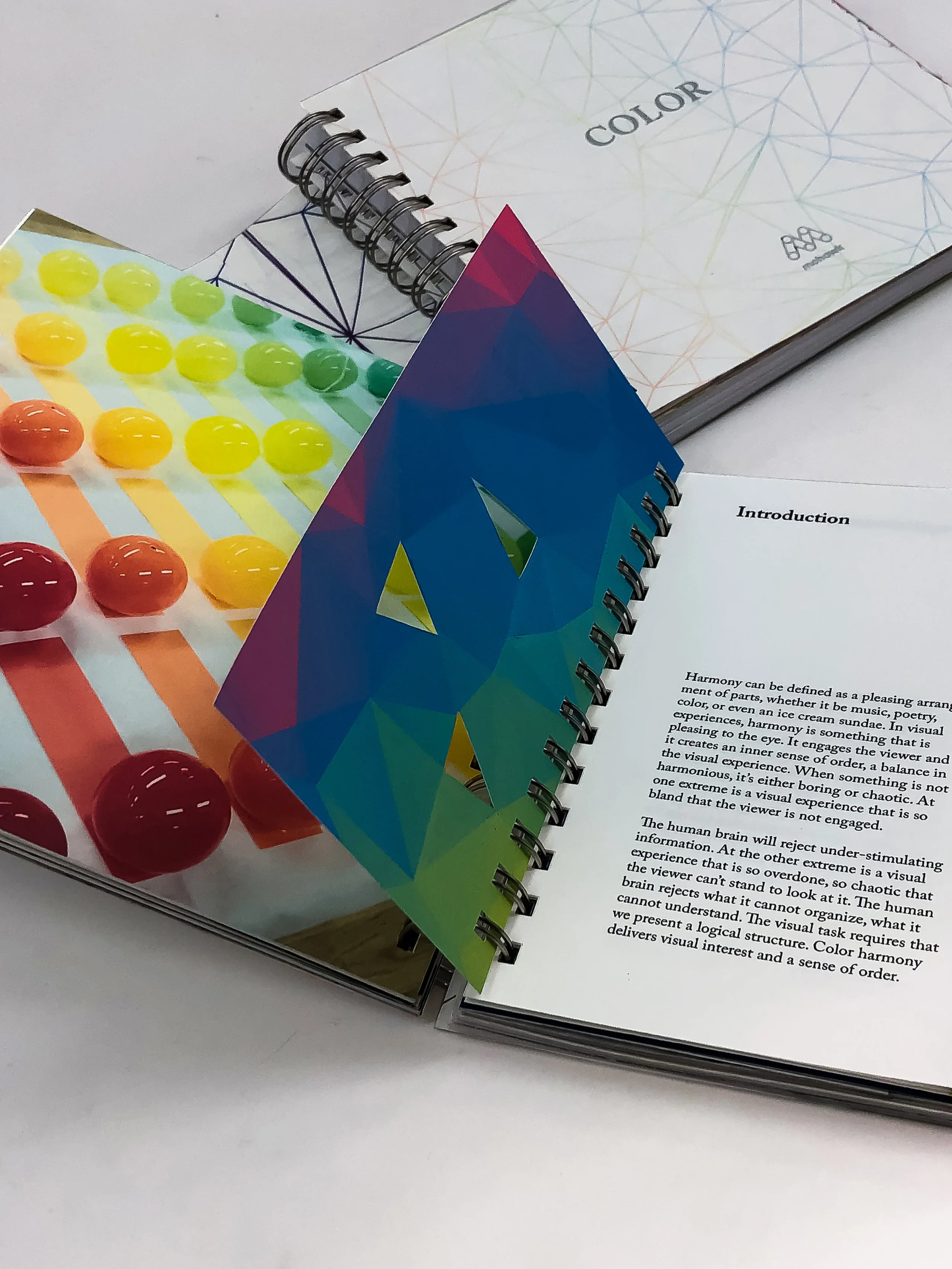
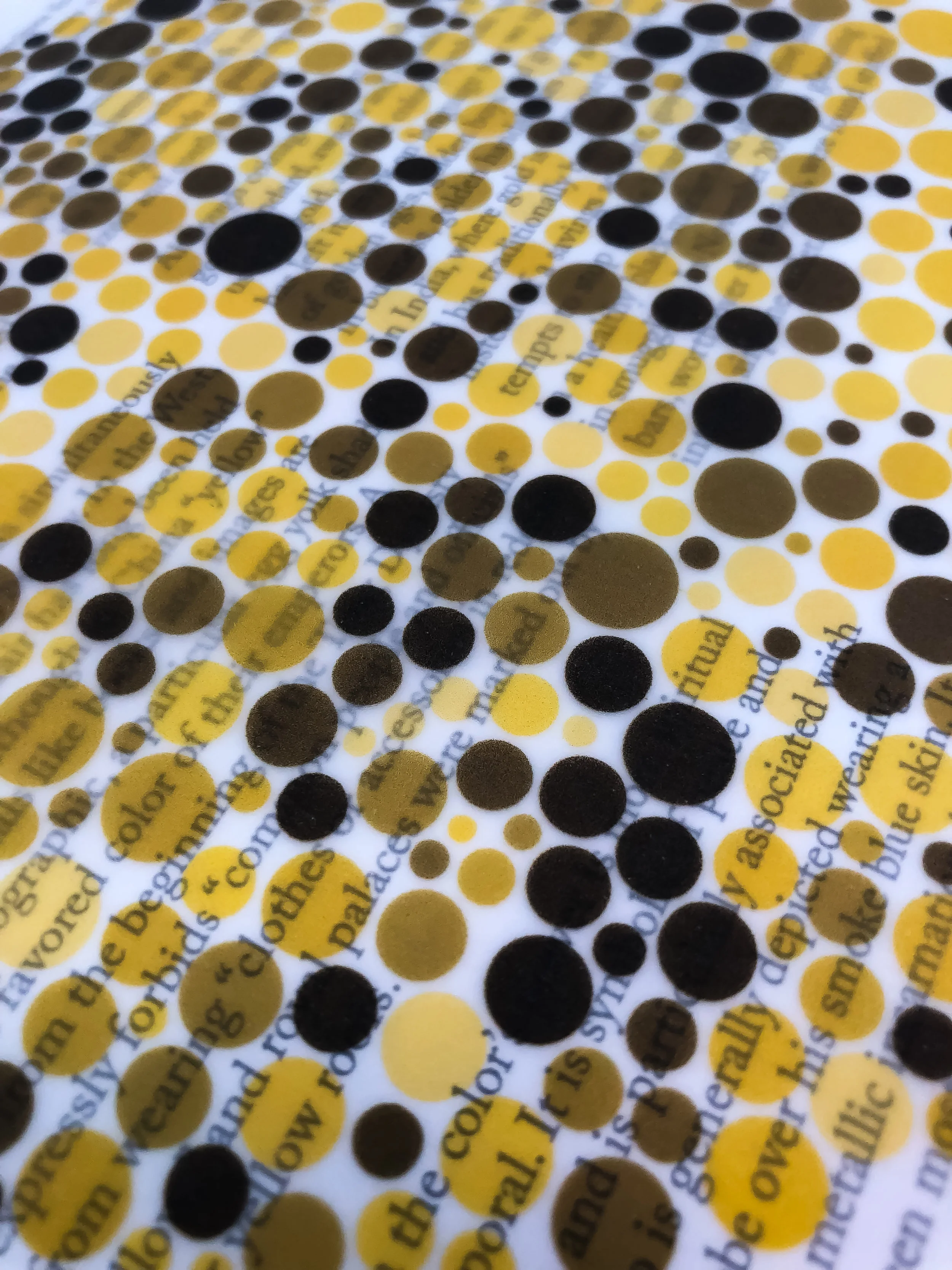
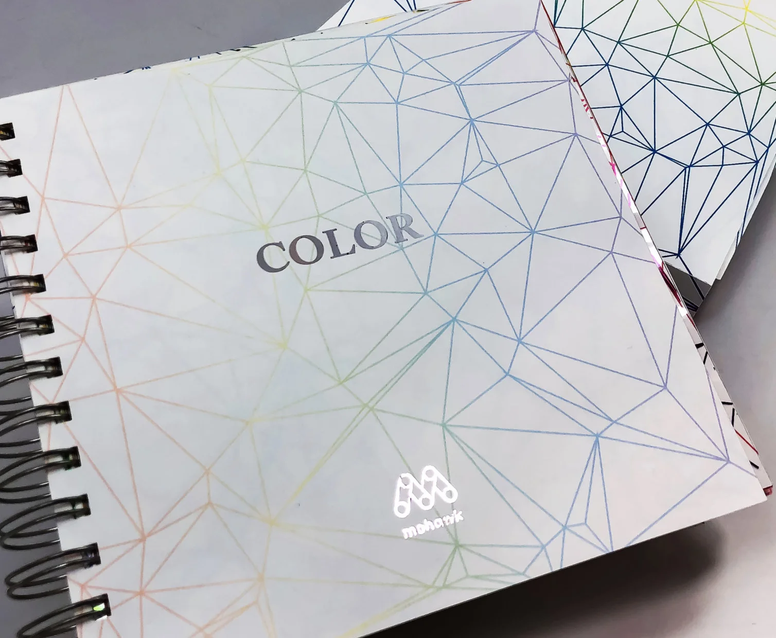
This project was created as a Mohawk Paper Promo book. The original idea was to create the book based on the Pantone Matching System but as I explored the topic further believed I did not have enough information which led to a book on color. It consists of 4 chapters all talking about color. Using my production skills the book includes di-cuts, foiling, vellum sheets and more.
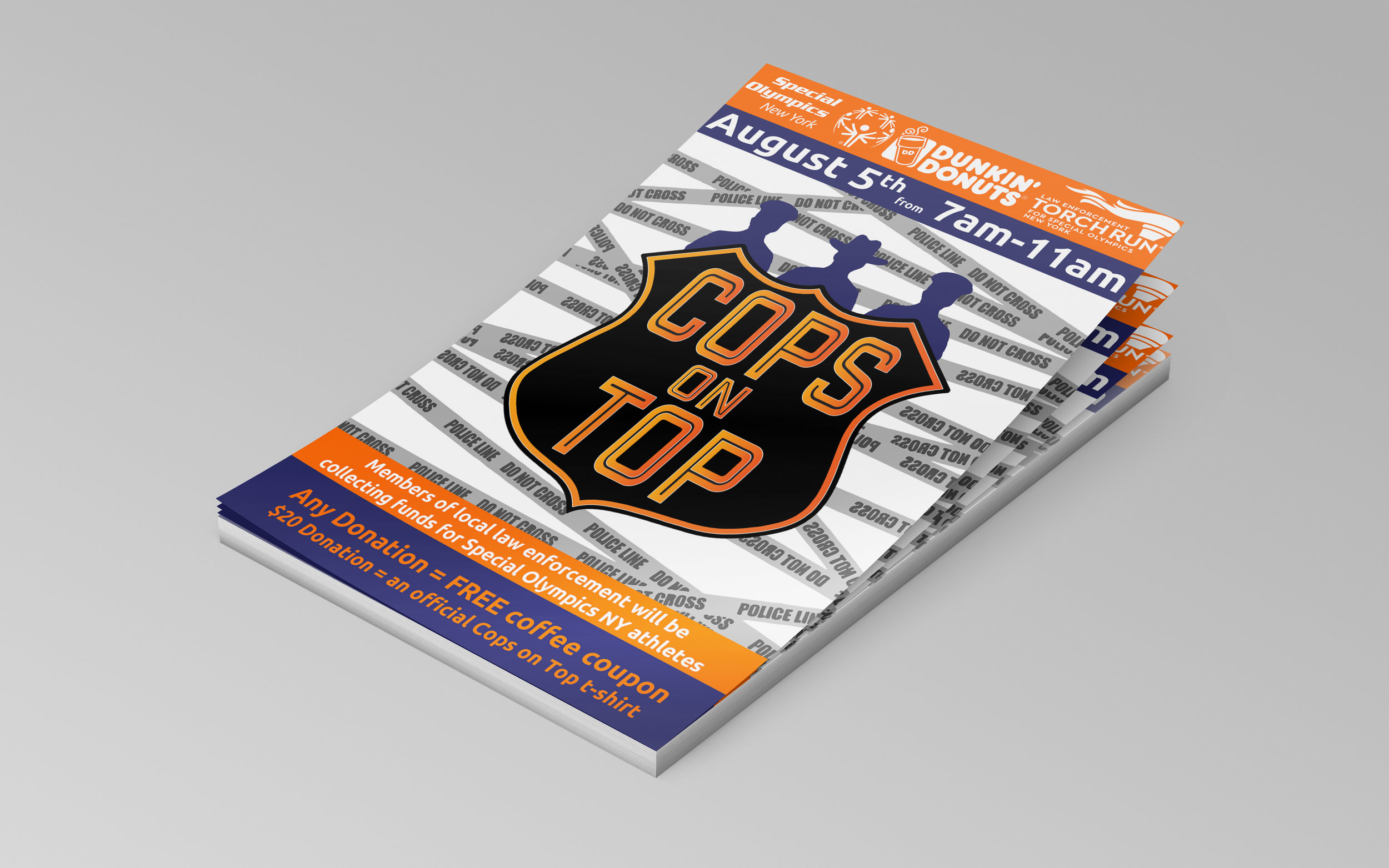
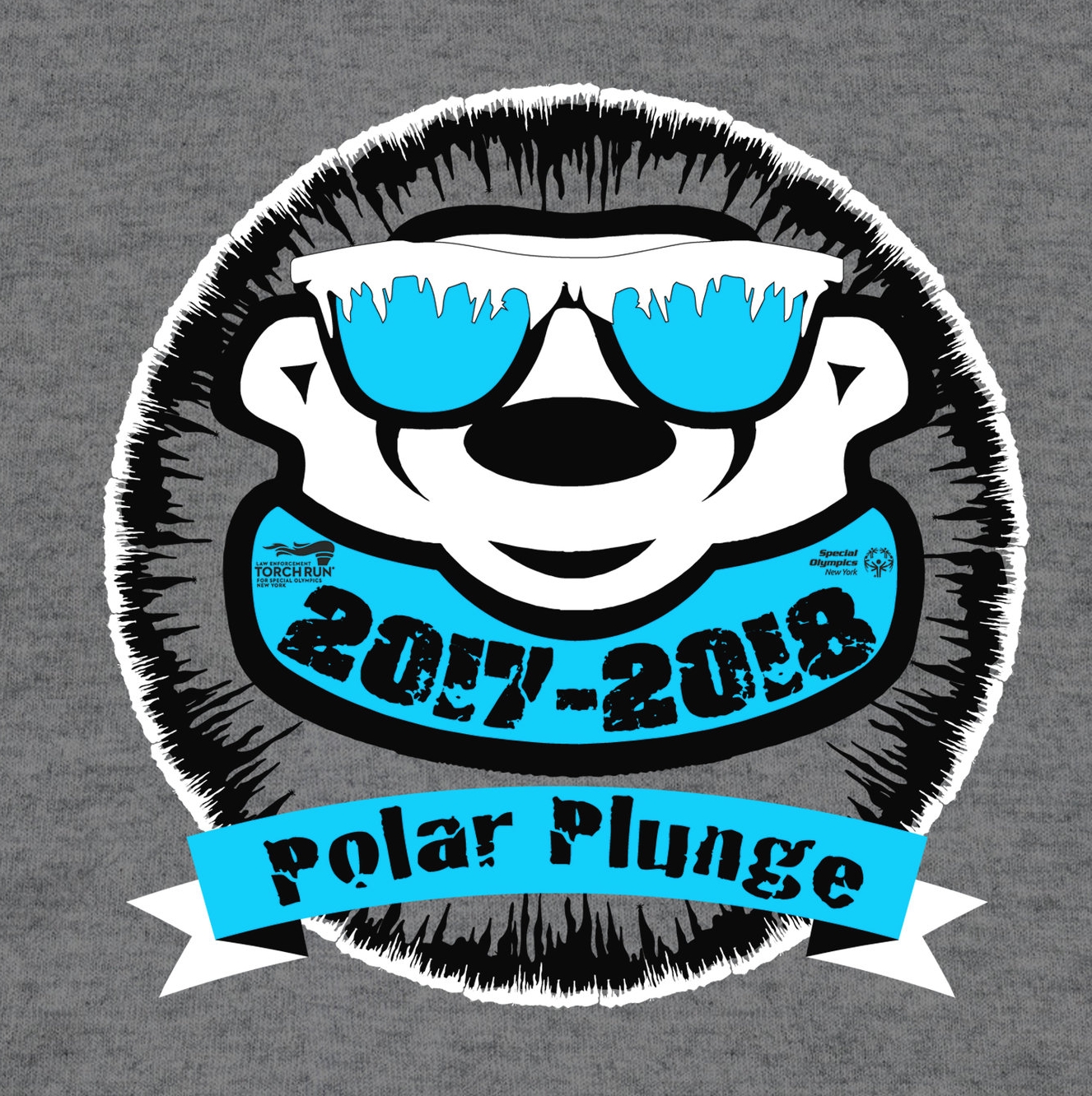
While working for Special Olympics, I had the opportunity to design for some of their amazing fundraising campaigns. One of which was the famous Polar Plunge event. This event is held all over the state of NY. This logo was used for the 2017-2018 Cops on Top campaign.
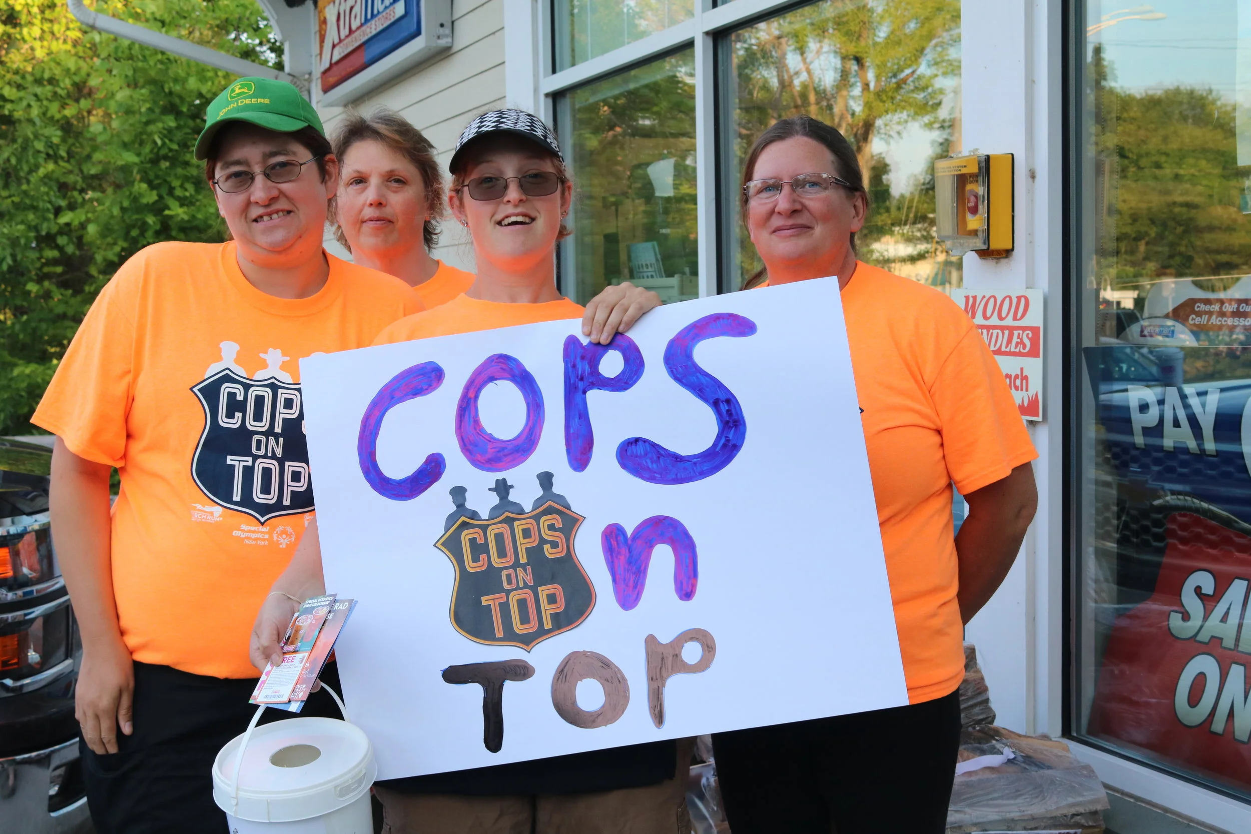
While working for Special Olympics, I had the opportunity to design for some of their amazing fundraising campaigns. One of which was the Cops on Tops event. This event is held at Dunkin Donuts locations all over the state of NY. This logo was used for the 2016 Cops on Top campaign.
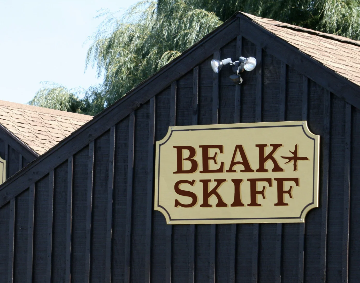
The goal of this project was to rebrand a small company. I decided to do Beak and Skiff Apple Orchards. Beak and Skiff is an orchard that I have been going to with my family for as long as I can remember. It used to be a single barn with one tractor and just apple picking but has grown into a larger company that includes a distillery, cafe and much more.
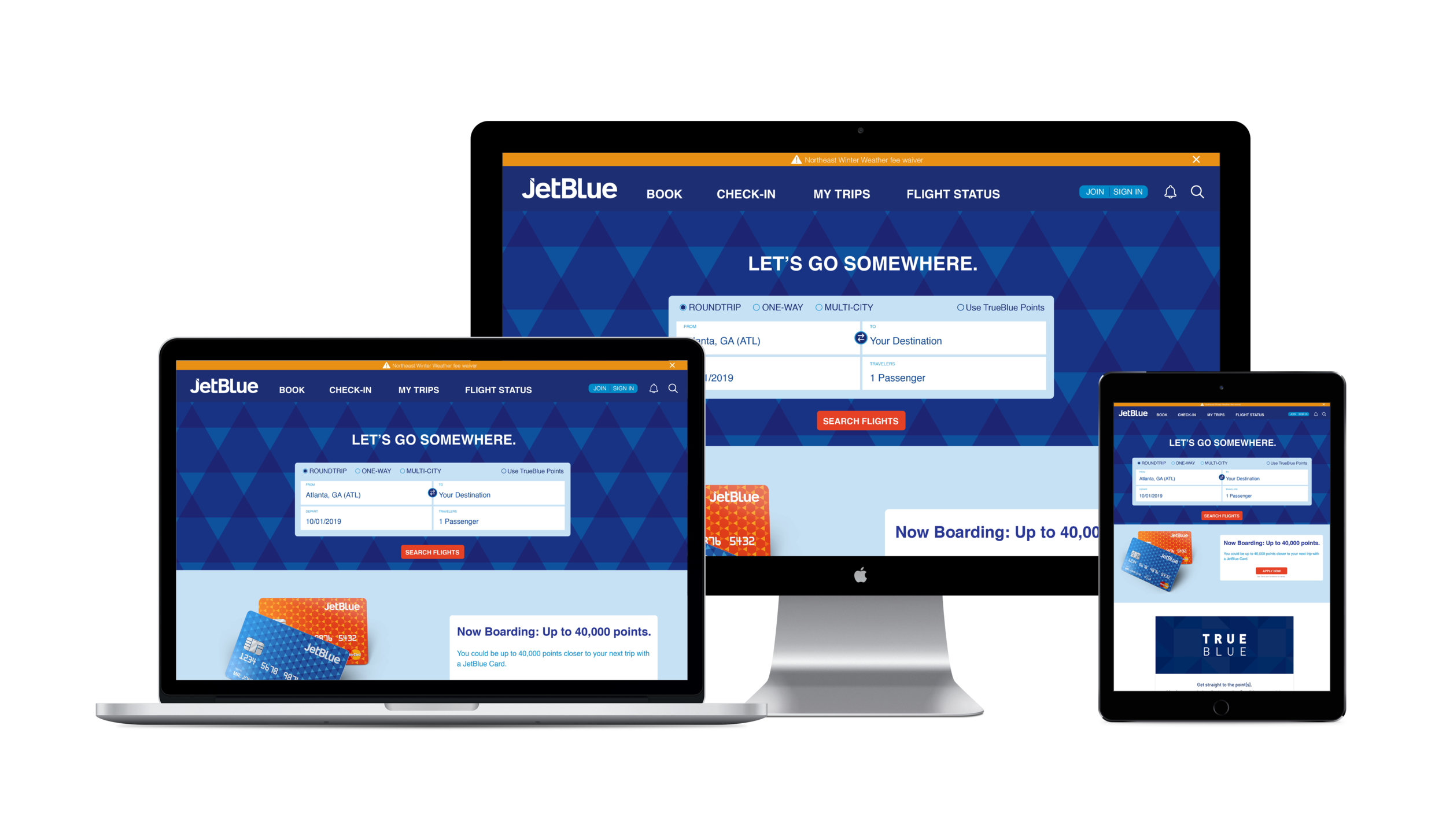
The goal of this project was to rebrand a large company. I decided to do JetBlue Airways. I have been flying since I was a baby and flying on JetBlue ever since they started. Knowing the company and many people that work for it very well I decided to give them an update. I kept the sans serif typeface to keep the modern feel of the company but updated to bring it into the future along with an updated color palette and pattern.
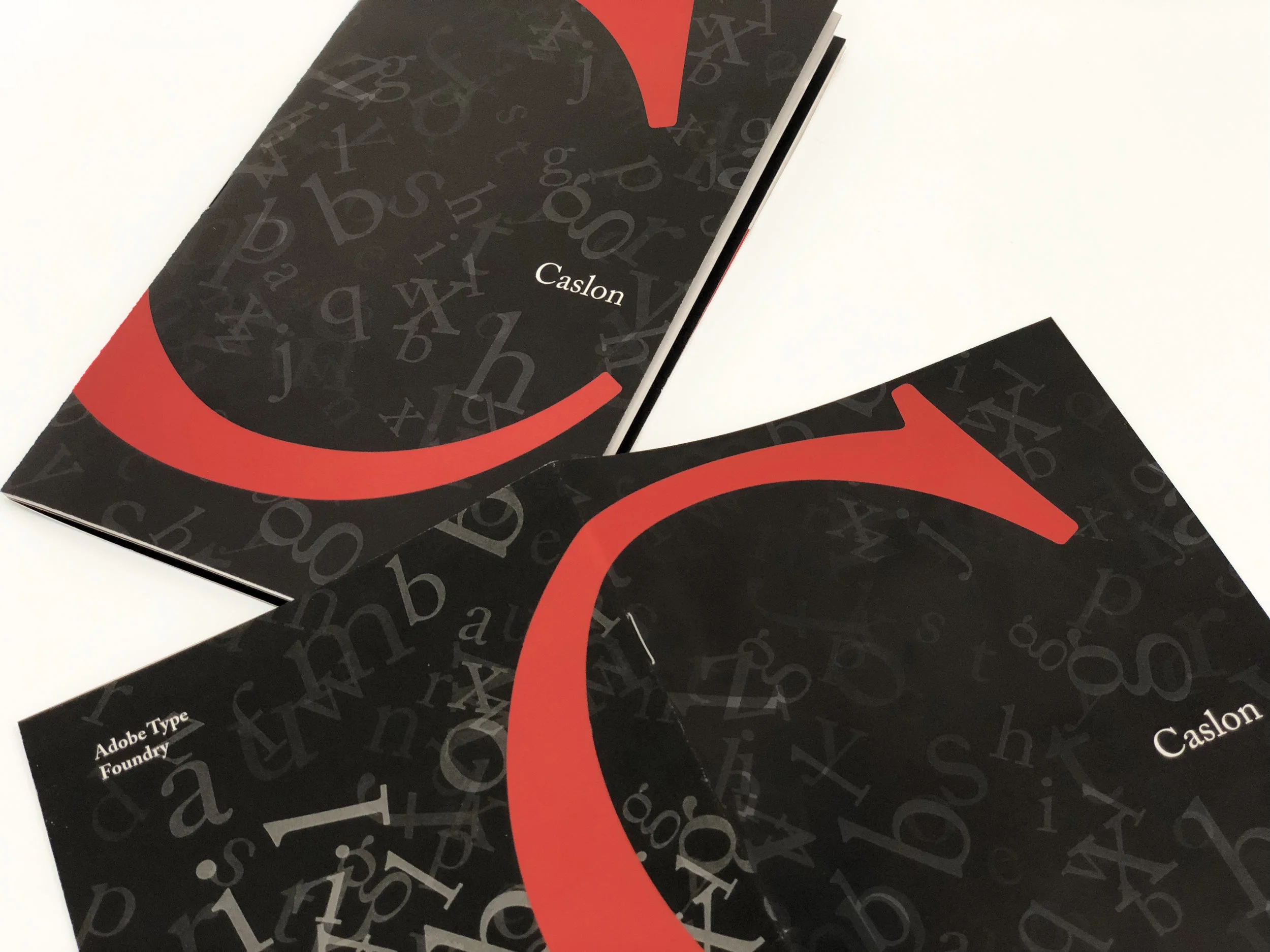
This piece is a type specimen book for the typeface Caslon. The pages include what a typical specimen would have such as showing the whole typeface along with different sizes and weights. Along with the simple examples there is a playfulness to it that shows what the typeface is able to do when pushed beyond the typical use as body copy.
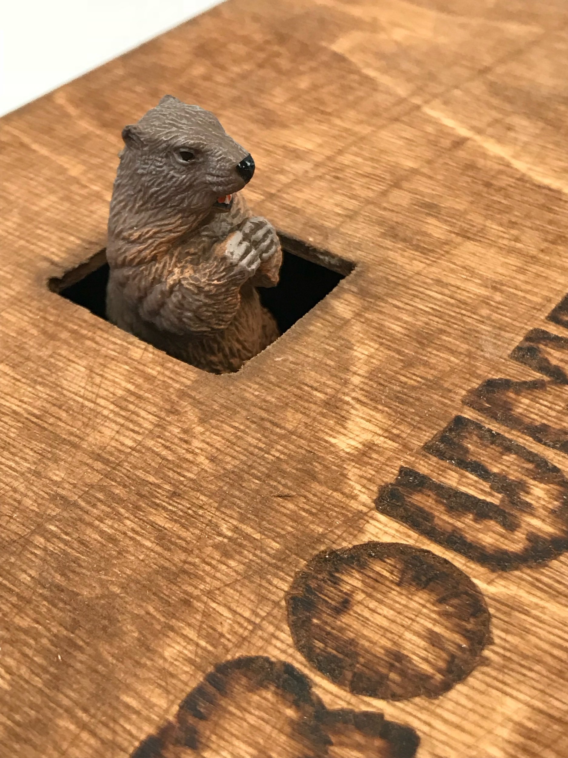
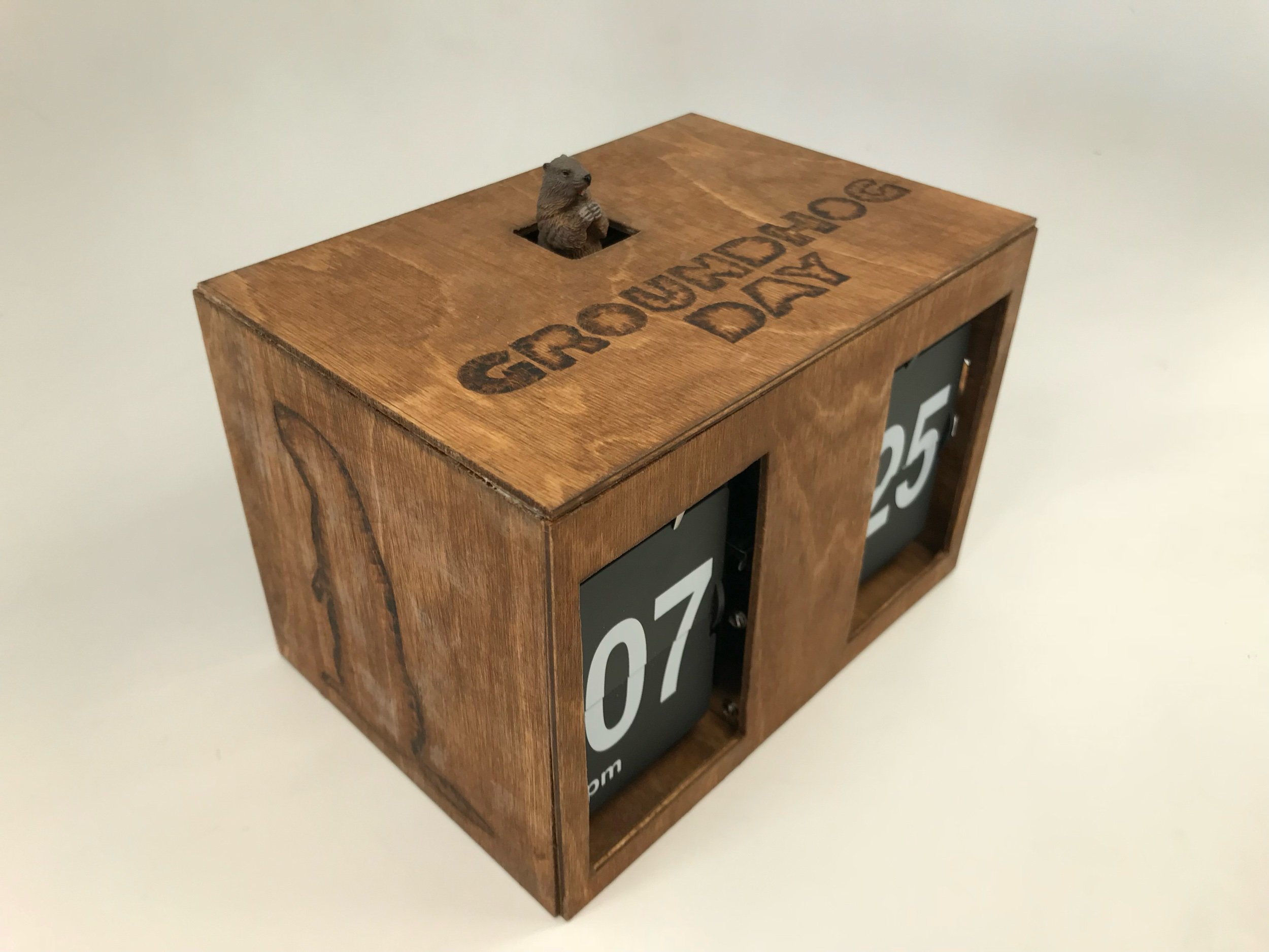
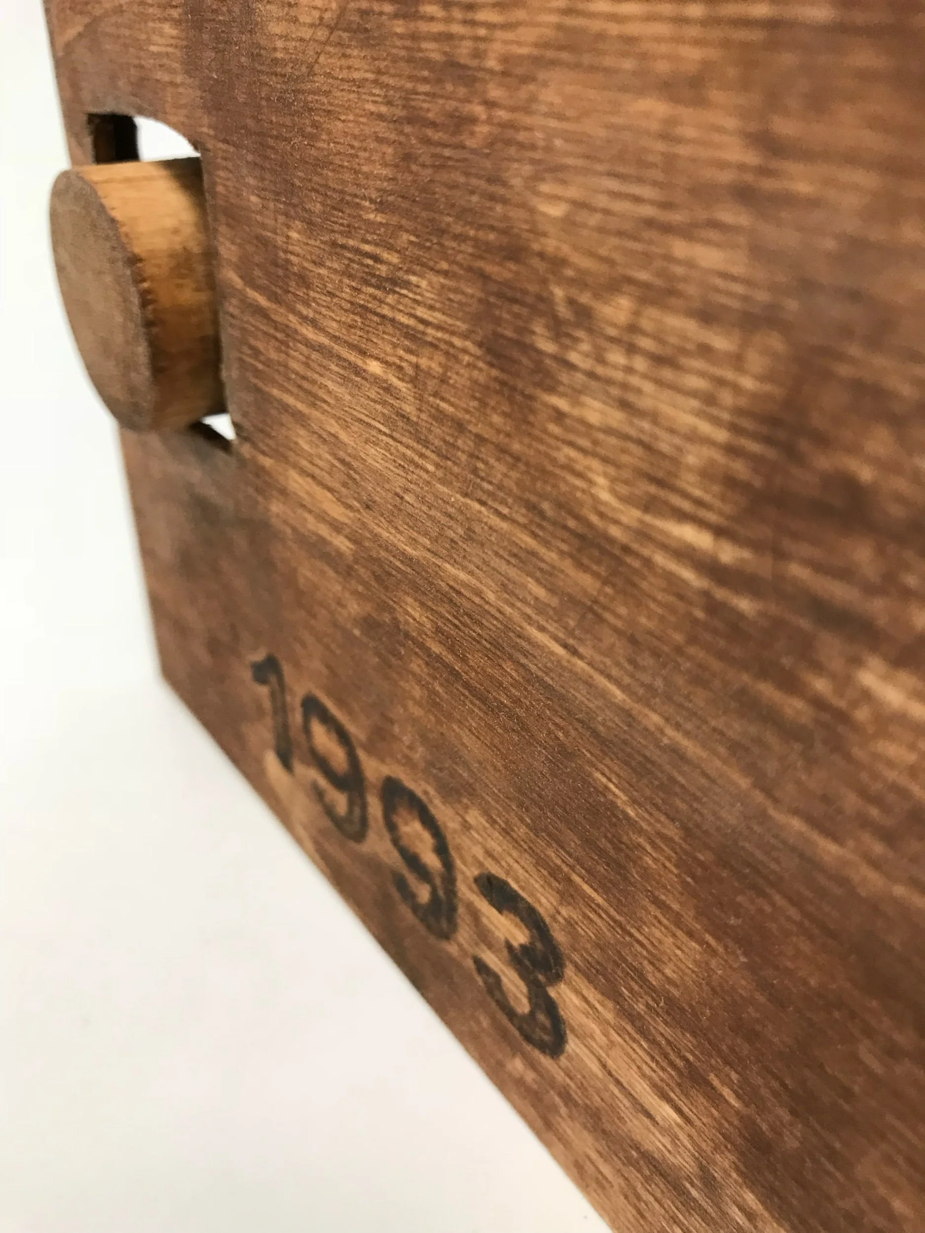
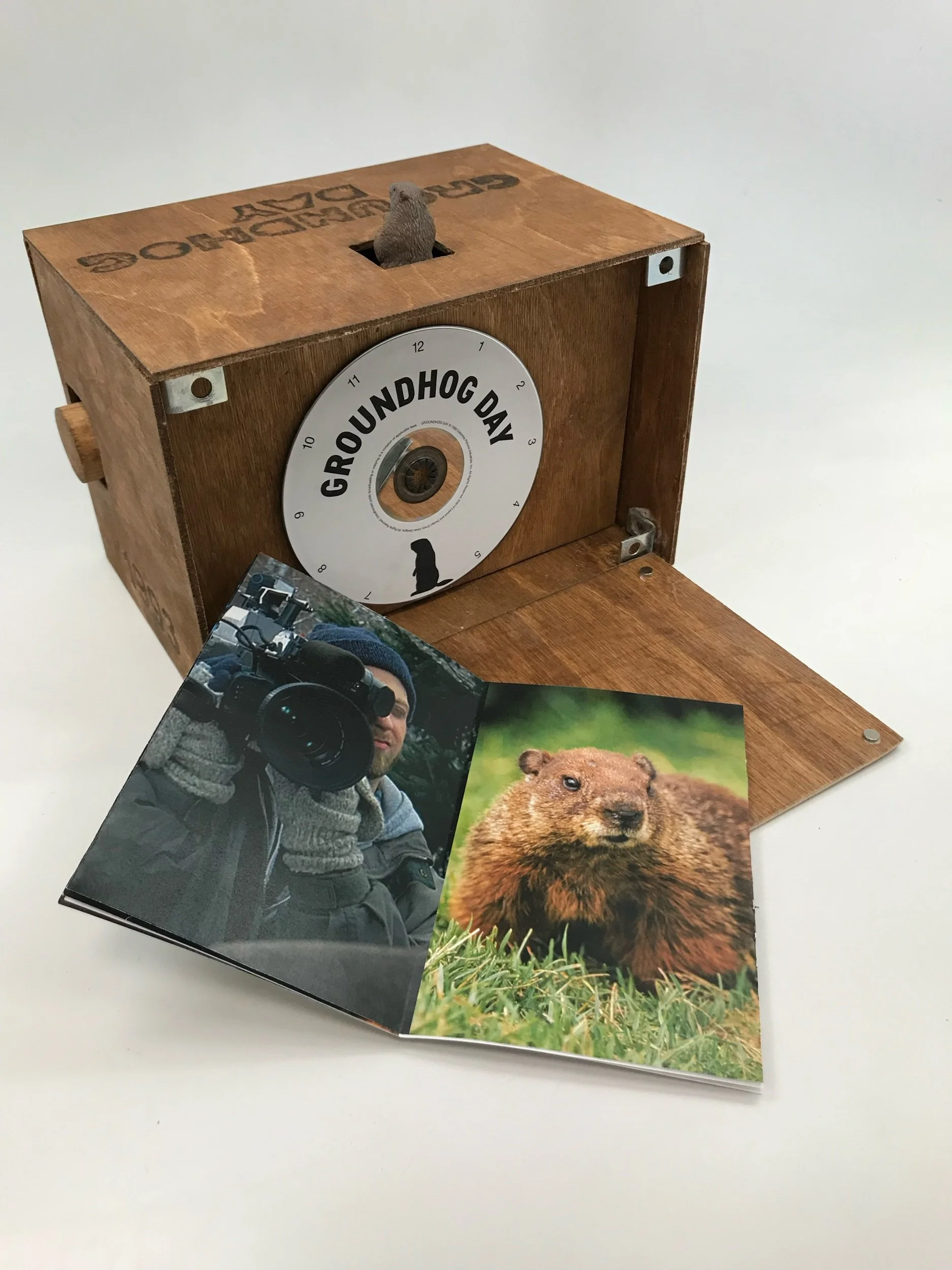
This clock was created based off of the movie from the movie Groundhogs day. Instead of having the typical plastic dvd case that usually gets thrown away, this projects intent was to create a more useful and meaningful package to house the dvd.
The idea behind this assignment was to create an event invitation for the SCAD FASH exhibit Pierre Cardin: Pursuit of the Future inspired by the exhibit.
This poster series is based off of a series of digital pieces I did a few years back. While the pieces alone stood for themselves I wanted to use them for a greater purpose. The original idea for the x-ray series was chronic pain as that illness runs in my family. The x-ray pieces use actual x-rays from my grandmother, mother, sister and myself to created a whole piece of the body. It is meant to symbolize the pain and strength in the maternal line of our family. I have digitally taken apart x-rays of all of us and pieced them back together like a puzzle to show the strength of my family but also the bond between us. I took the pieces and used them to create a strong influential poster to explain how chronic pain can affect a family and a person.
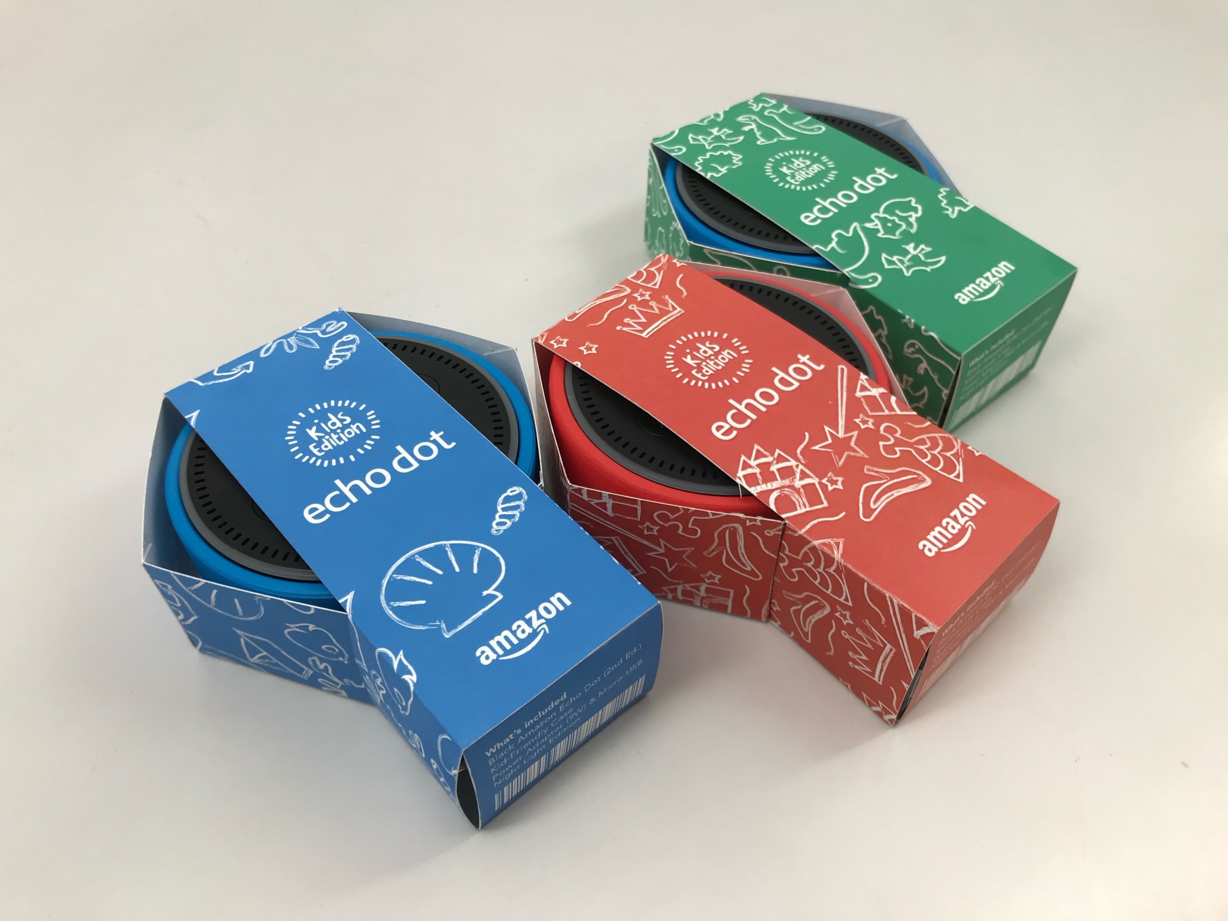
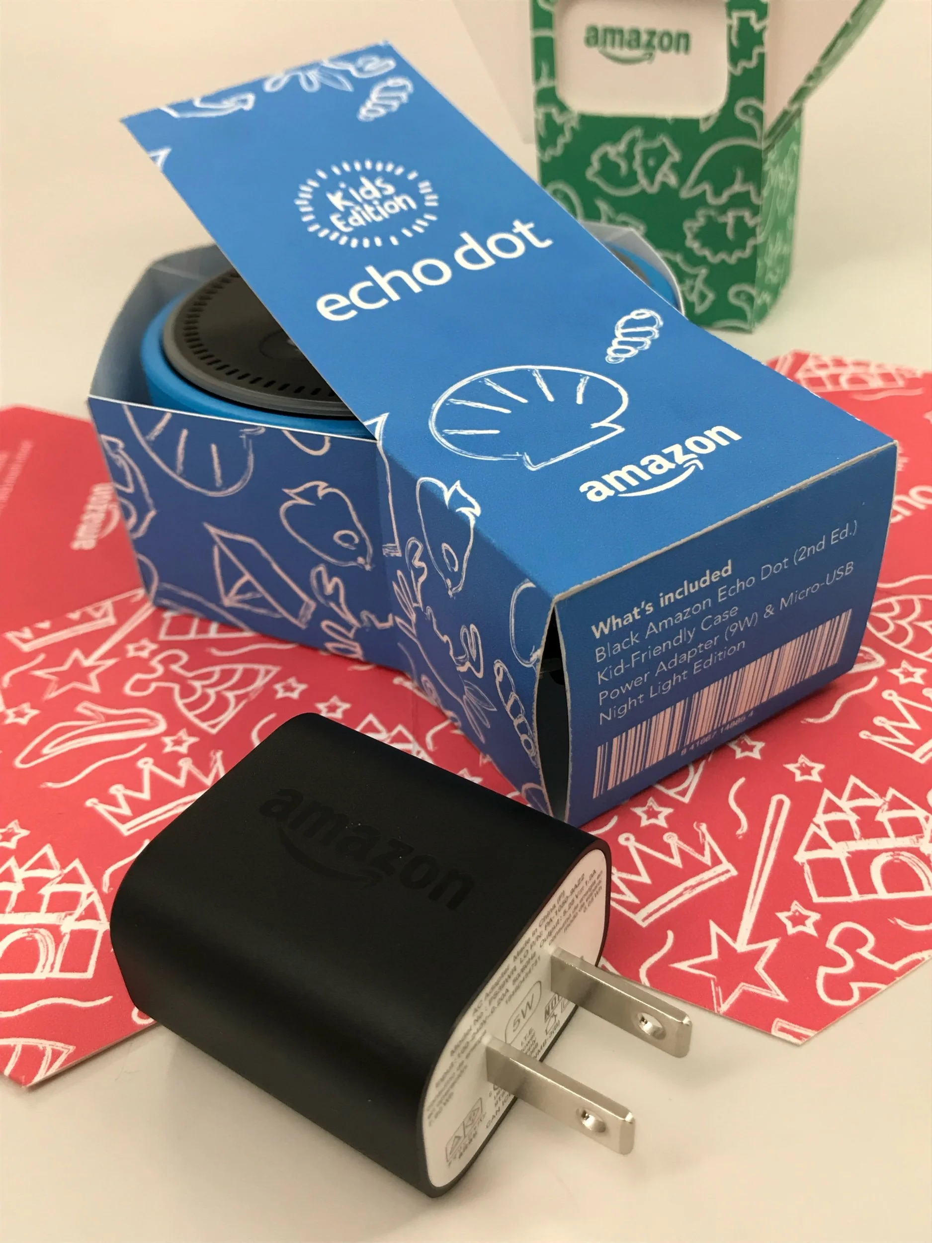
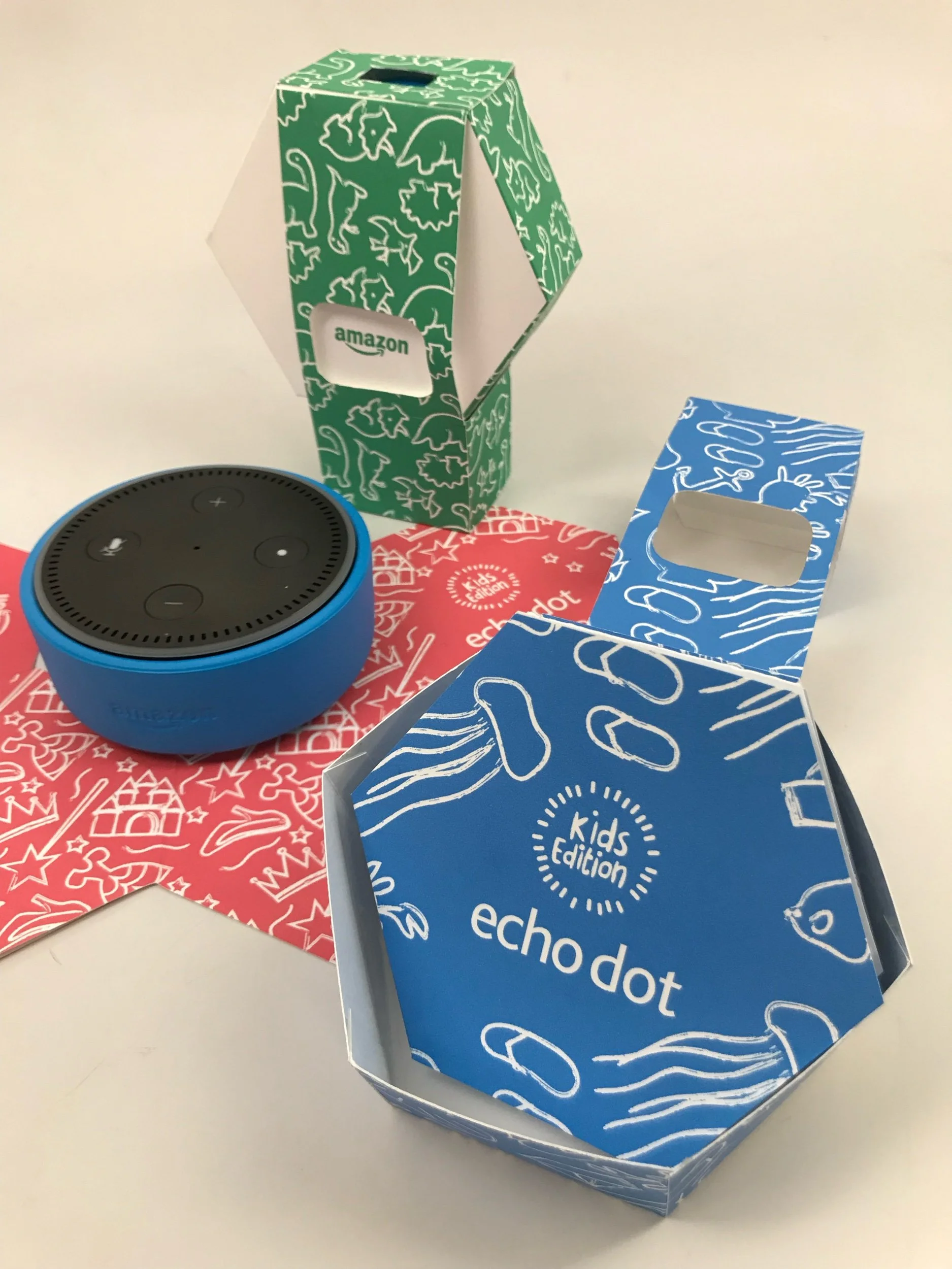
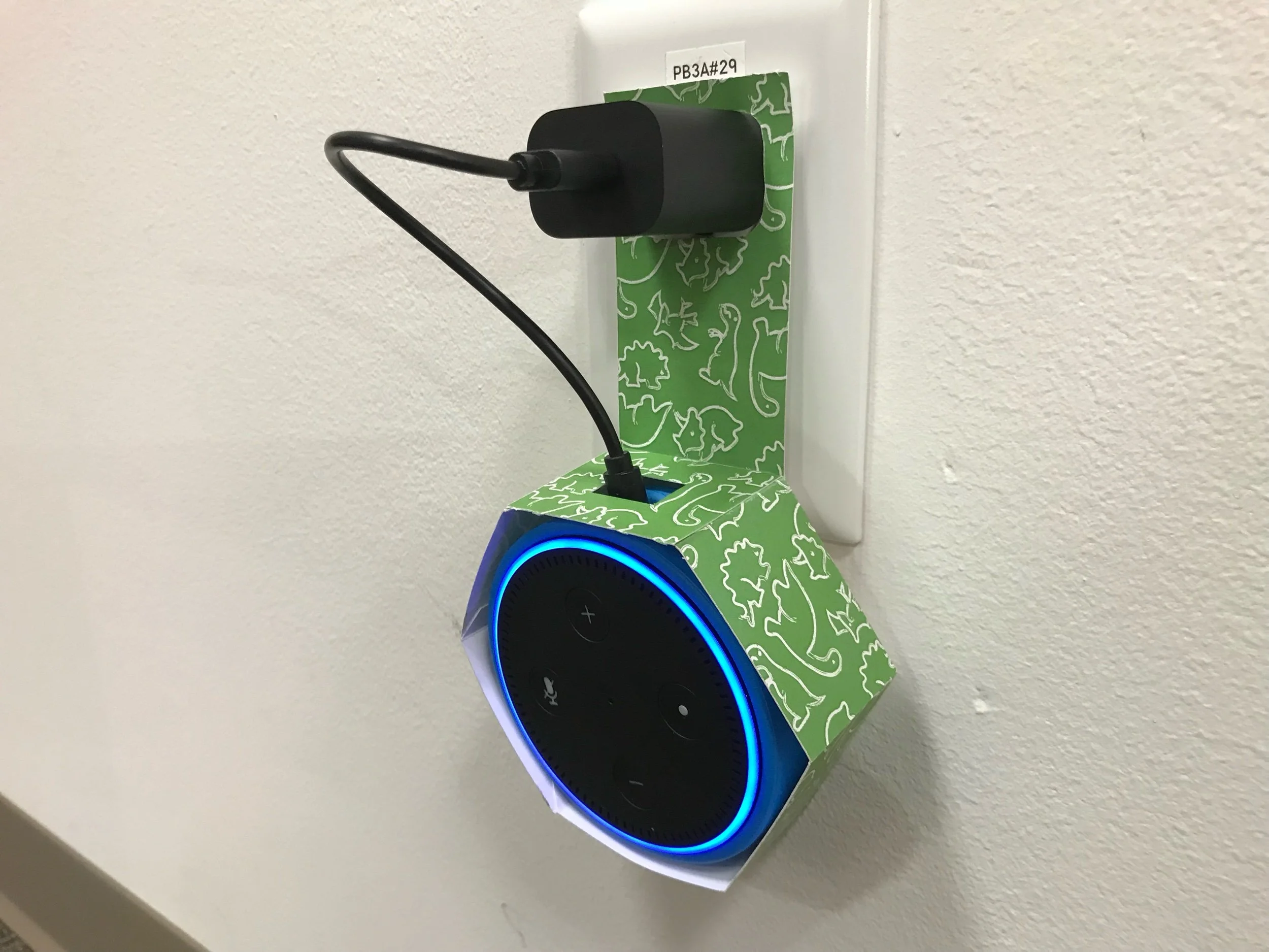
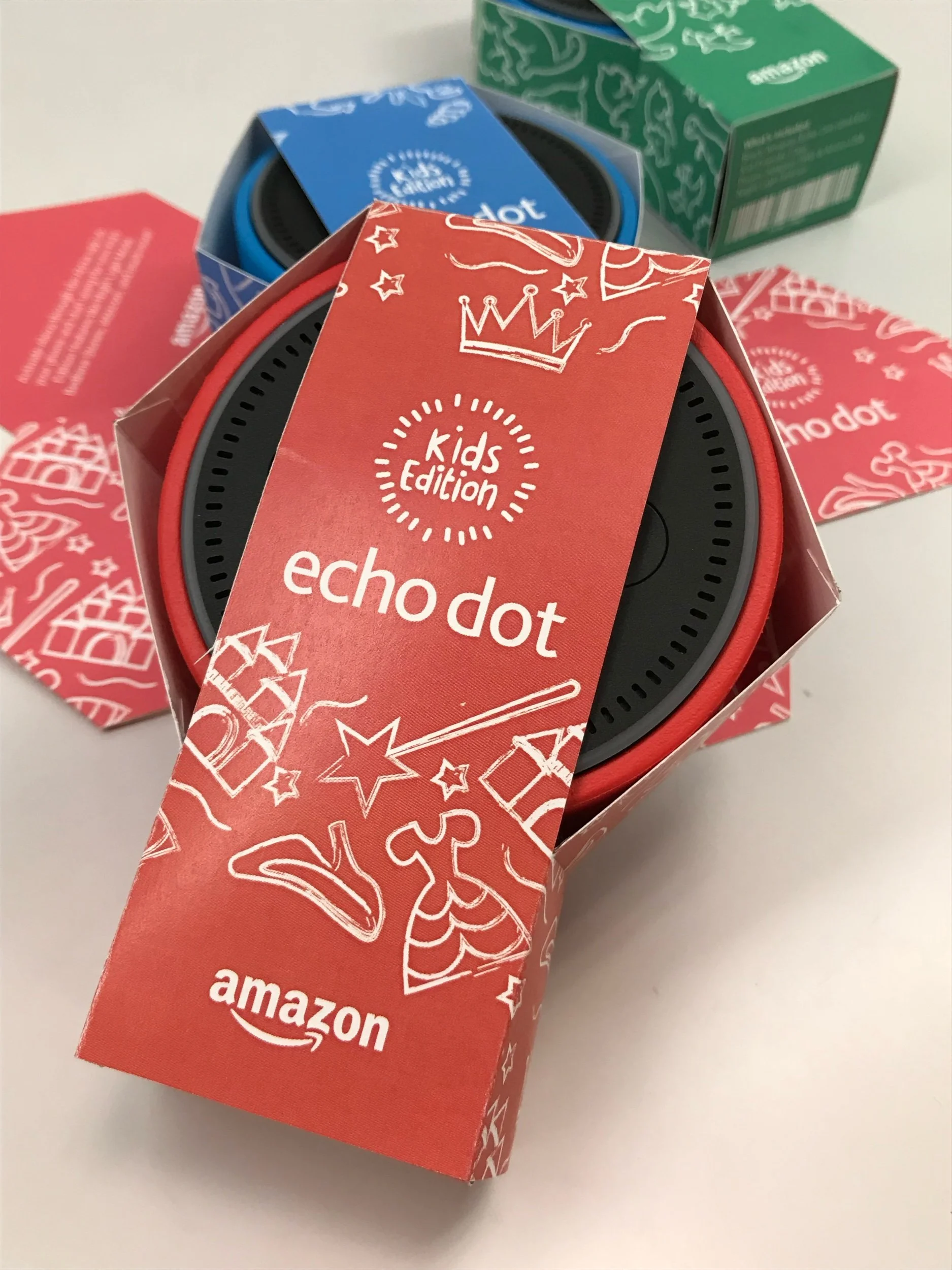
This project was created when given the challenge to create a more sustainable and eco friendly packaging. Typically an Amazon Alexa comes with lots of plastic and boxes that end up in the trash. This packaging not only houses the Alexa and it’s charger but is also able to be used as a wall mount.
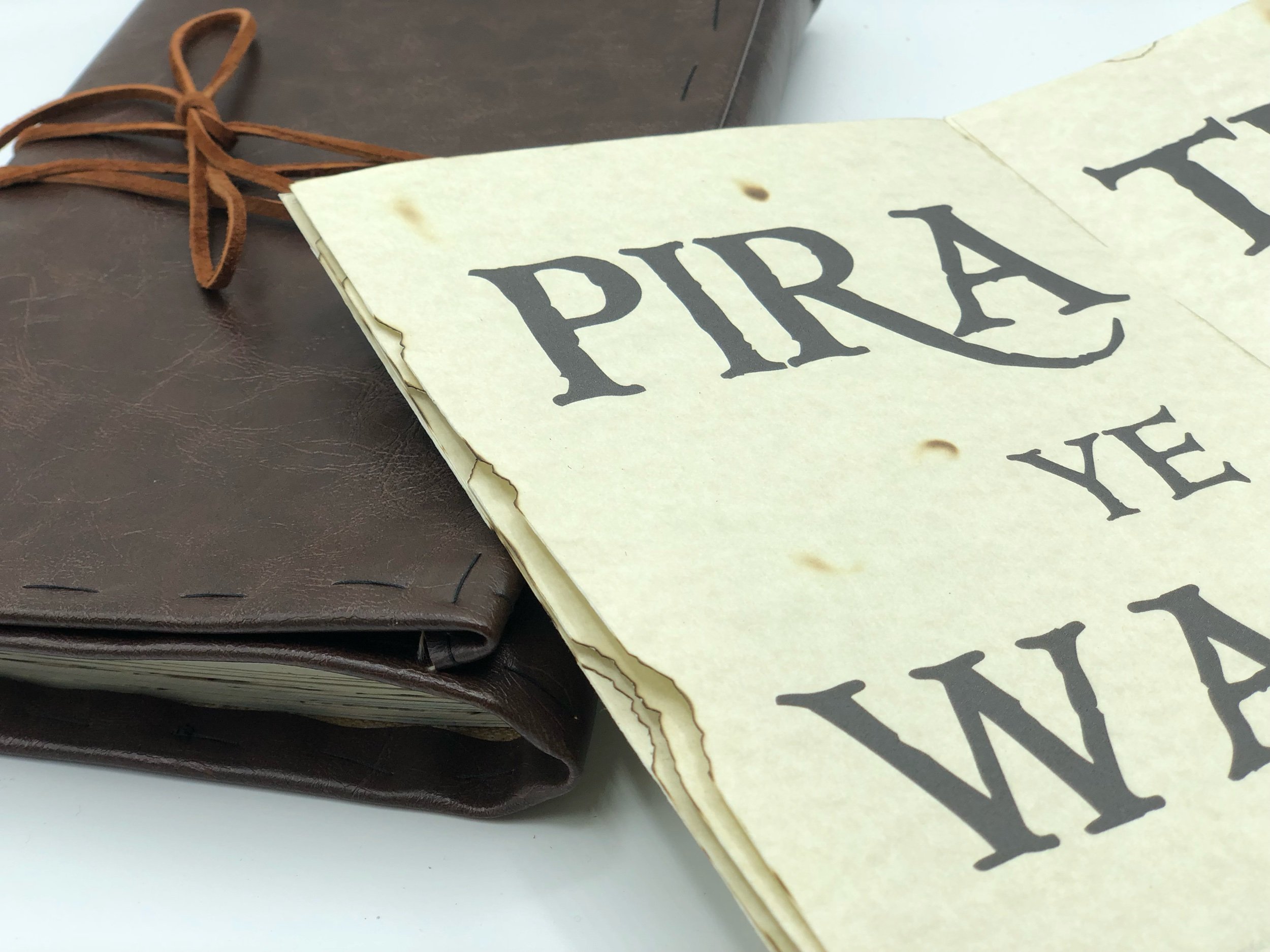
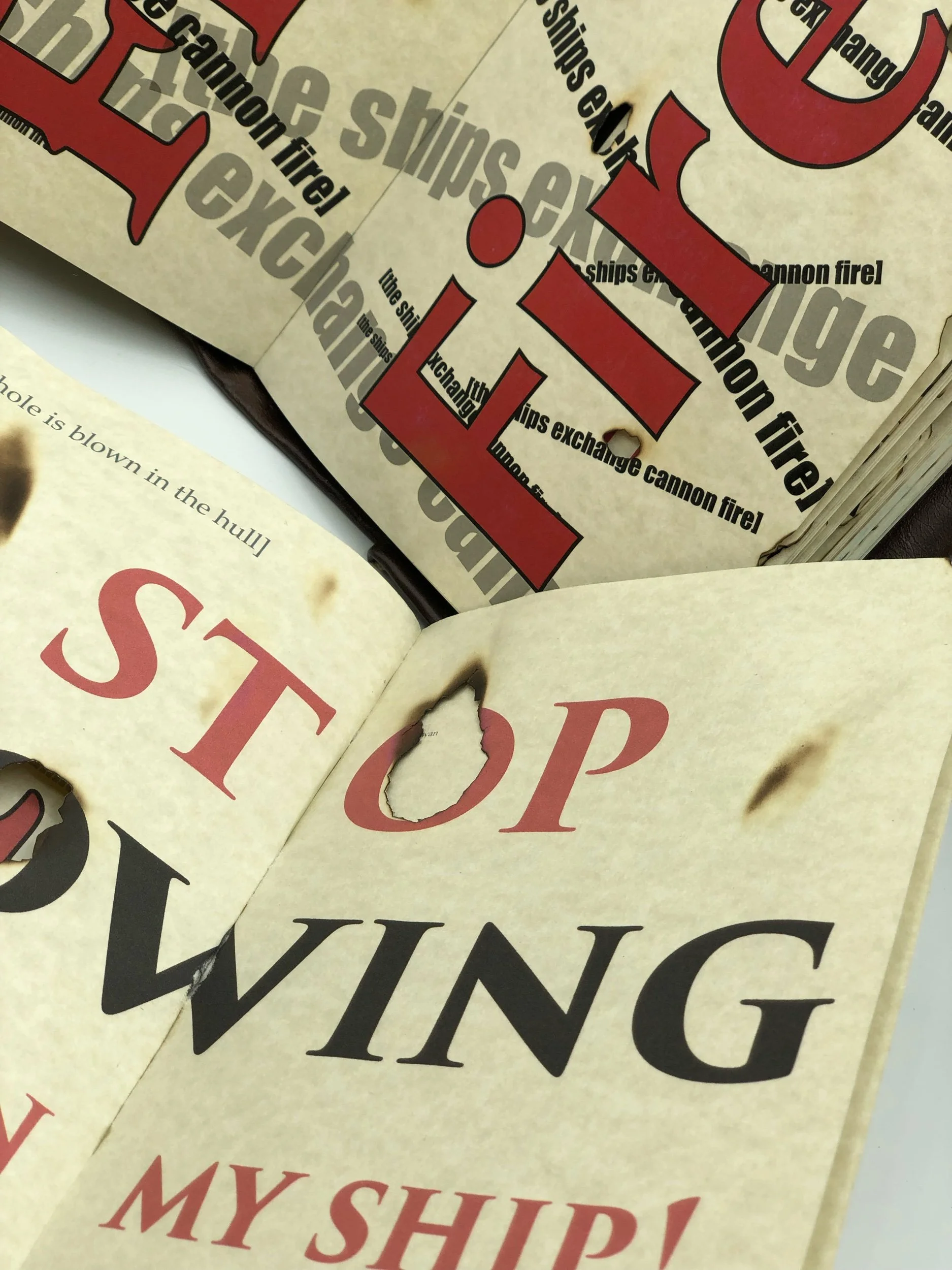
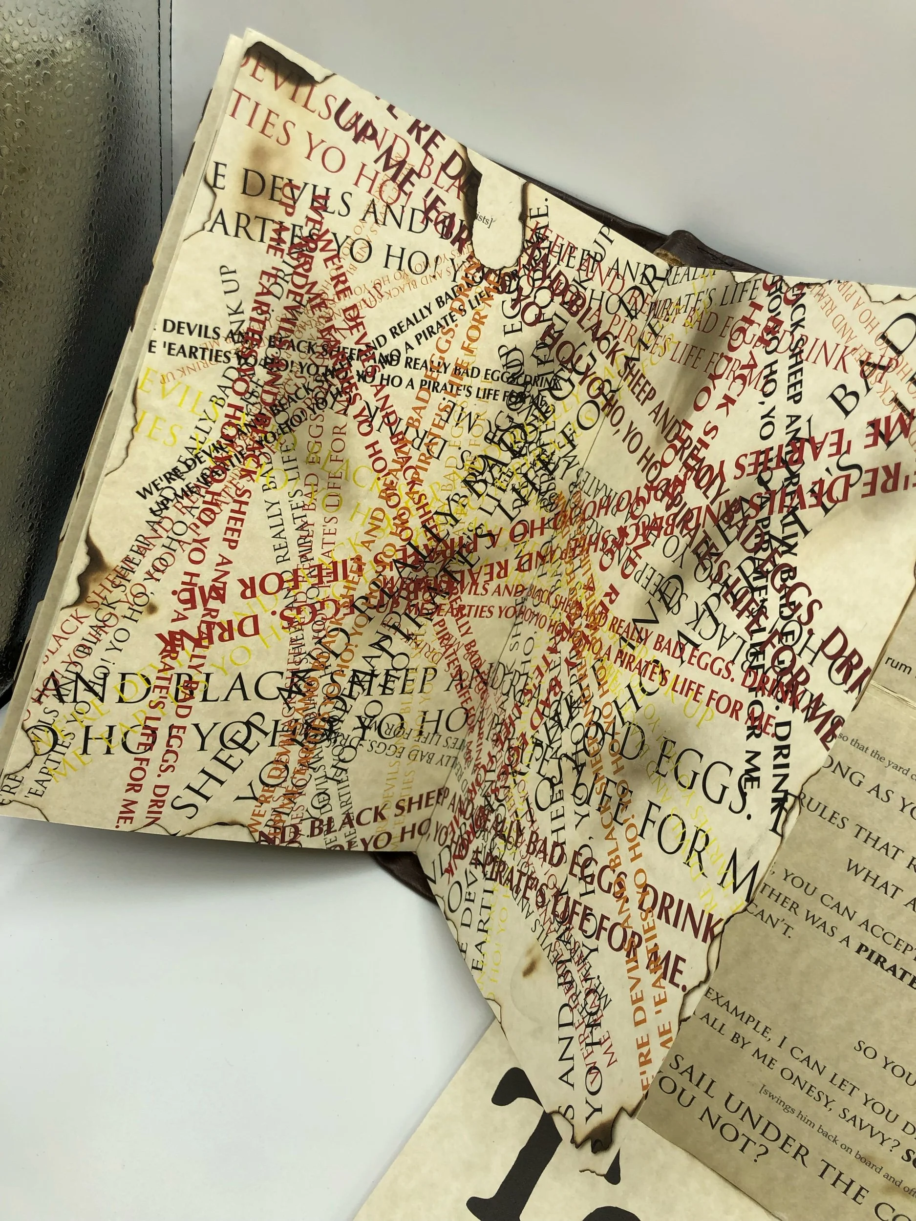
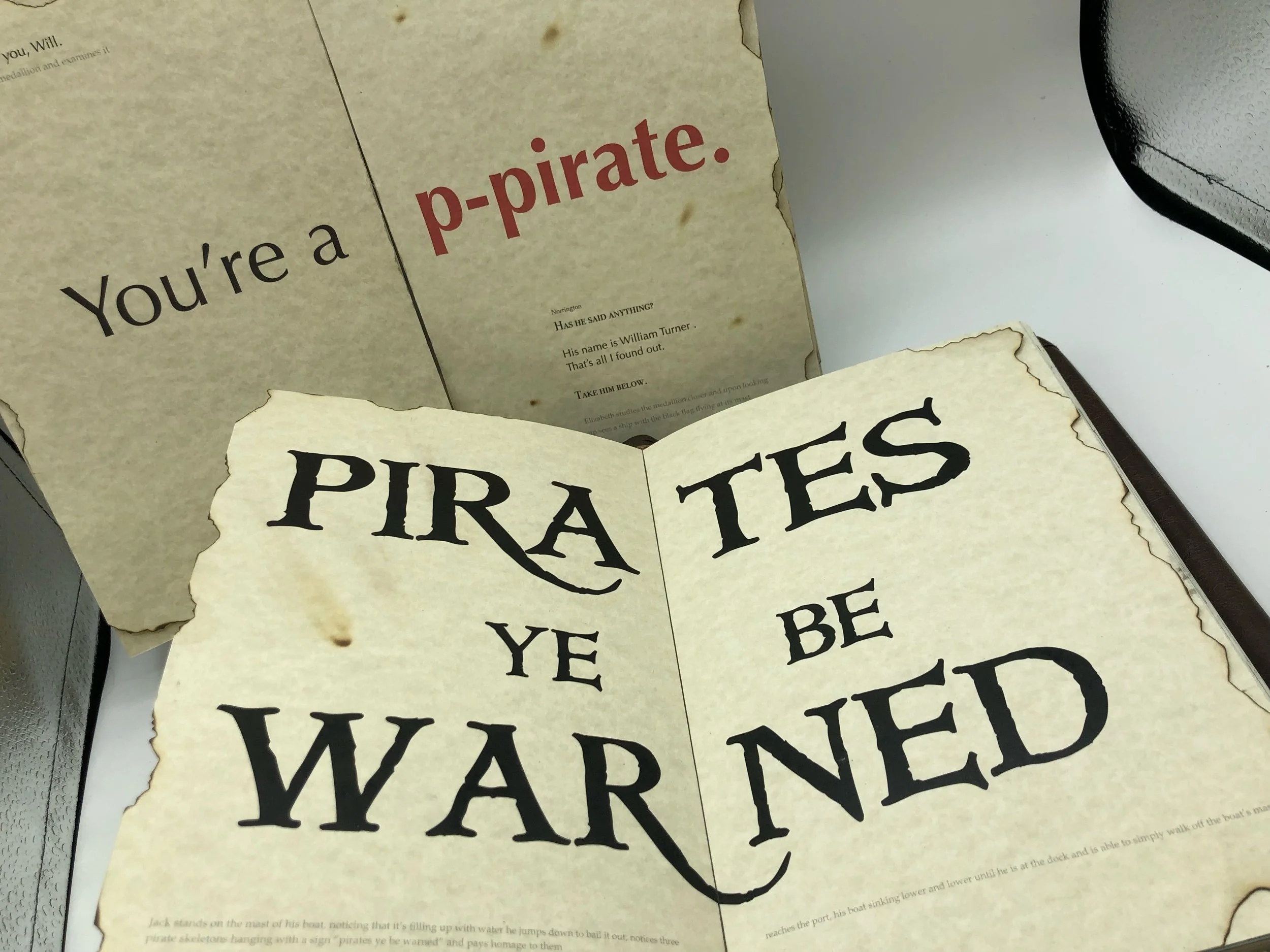
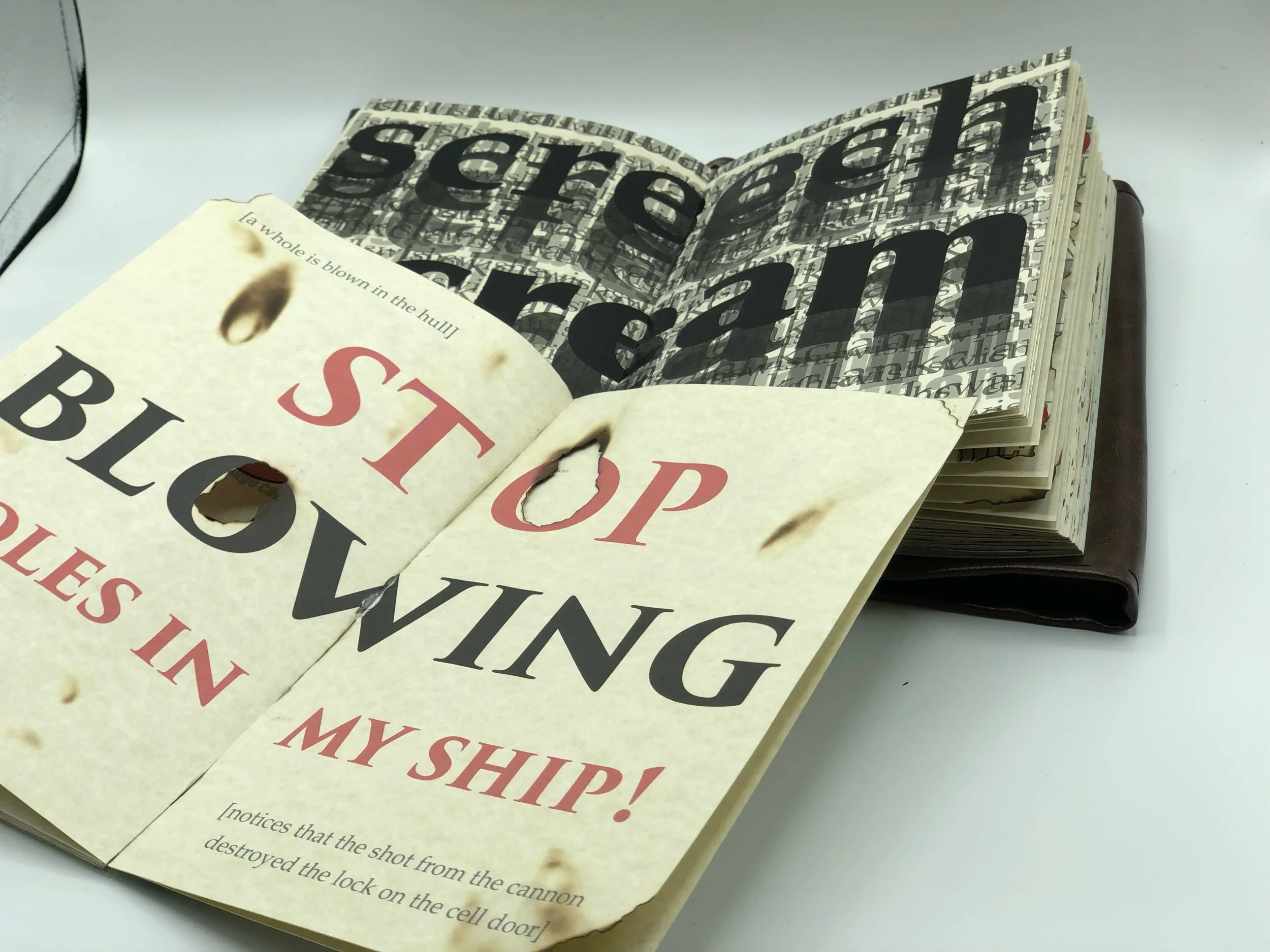
This book was created based off of the script from the movie Pirates of the Caribbean Curse of the Black Pearl. Using only type, this book experimented with scale and color to created imagery and emotions that went along with the movie.